
基于tensorflow的手写数字识别(mnist)
本案例使用经典的MNIST手写数字数据集,通过Keras构建全连接神经网络,实现0-9数字的分类识别。关键概念图解完整实现代码训练过程可视化模型效果深度分析。
项目概述
本案例使用经典的MNIST手写数字数据集,通过Keras构建全连接神经网络,实现0-9数字的分类识别。文章将包含:
- 关键概念图解
- 完整实现代码
- 训练过程可视化
- 模型效果深度分析

环境准备
import numpy as np
import matplotlib.pyplot as plt
from tensorflow import keras
from tensorflow.keras import layers
from sklearn.metrics import confusion_matrix
import seaborn as sns
三、数据加载与探索
3.1 加载数据集
# 加载内置MNIST数据集
(x_train, y_train), (x_test, y_test) = keras.datasets.mnist.load_data()

print("训练集形状:", x_train.shape)
print("测试集形状:", x_test.shape)
Downloading data from https://storage.googleapis.com/tensorflow/tf-keras-datasets/mnist.npz
11490434/11490434 ━━━━━━━━━━━━━━━━━━━━ 5s 0us/step
训练集形状: (60000, 28, 28)
测试集形状: (10000, 28, 28)
可以看到图像是28*28,每张图像一共有784个像素点。
3.2 数据可视化
plt.figure(figsize=(10,5))
for i in range(15):
    plt.subplot(3,5,i+1)
    plt.imshow(x_train[i], cmap='gray')
    plt.title(f"Label: {


       y_train[i]}")
    plt.axis('off')
plt.tight_layout()
plt.savefig('mnist_samples.png', dpi=300)
plt.show()

四、数据预处理
4.1 数据归一化
# 将像素值缩放到0-1范围
x_train = x_train.astype("float32") / 255
x_test = x_test.astype("float32") / 255

# 将图像展平为784维向量
x_train = x_train.reshape(-1, 784)
x_test = x_test.reshape(-1, 784)

# 标签转为one-hot编码
y_train = keras.utils.to_categorical(y_train, 10)
y_test = keras.utils.to_categorical(y_test, 10)
为什么使用One-Hot编码?
将类别标签转换为二进制向量表示:
数字5 -> [0,0,0,0,0,1,0,0,0,0]
- 消除数字间的顺序关系
- 适配分类任务的输出层设计
4.2 数据分布分析
plt.figure(figsize=(8,5))
plt.hist(y_train.argmax(axis=1), bins=10, rwidth=0.8)
plt.xticks(range(10))
plt.xlabel('Digit Class')
plt.ylabel('Count')
plt.title('Class Distribution')
plt.savefig('class_distribution.png', dpi=300)
plt.show()
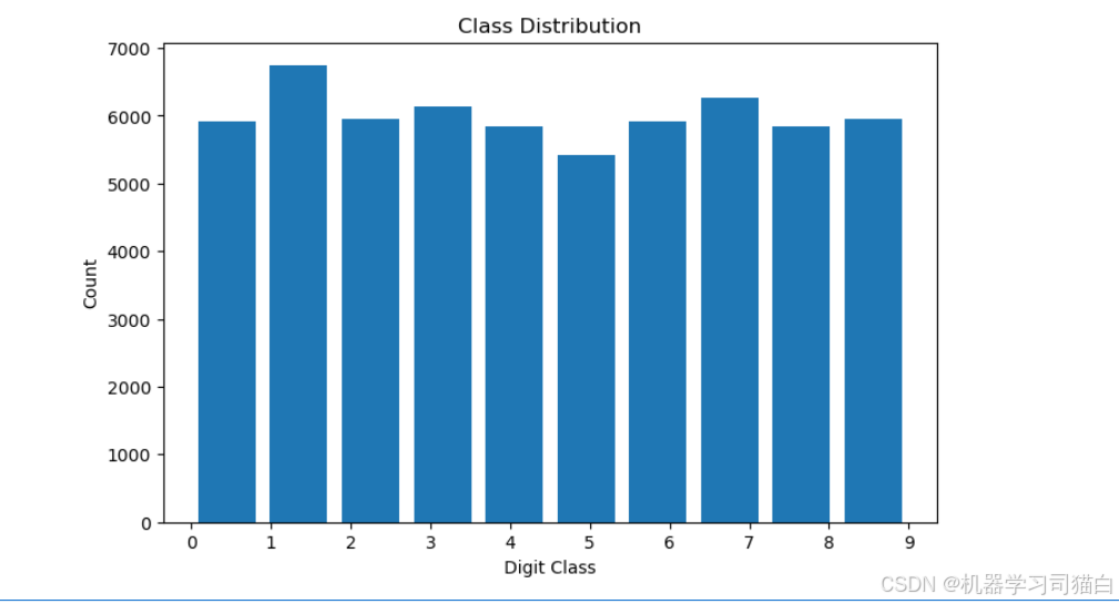
可以看到每种数字的数量基本都在5000~6000之间,只有数字1的数量最多。
五、模型构建
5.1 网络结构设计
model = keras.Sequential([
    layers.Dense(512, activation='relu', input_shape=(784,)),
    layers.Dropout(0.2),
    layers.Dense(256, activation='relu'),
    layers.Dense(10, activation='softmax')
])

model.summary()
| Layer (type) | Output Shape | Param # |
|---|---|---|
| dense (Dense) | (None, 512) | 401,920 |
| dropout (Dropout) | (None, 512) | 0 |
| dense_1 (Dense) | (None, 256) | 131,328 |
| dense_2 (Dense) | (None, 10) | 2,570 |
- 这个网络架构采用了两层全连接层(dense),一个Dropout层来防止过拟合,最后一个输出层用于分类。
- 各个Dense层的作用是逐渐将输入数据的维度变换,提取数据的高层特征,最后输出一个10维的向量,表示每个类别的预测概率(如果使用Softmax激活函数的话)。
- Dropout层的引入使得训练过程更稳定,减少过拟合的风险。
参数数量 = (输入特征数+1) * 输出特征数
(512+1)* 256 = 131,328
5.3 模型编译
model.compile(
    optimizer=keras.optimizers.Adam(learning_rate=0.001),
    loss='categorical_crossentropy',
    metrics=['accuracy']
)
设置优化器为adam,并且指定学习率为0.001,损失函数为categorical_crossentropy,评估指标为准确率。
六、模型训练
6.1 训练过程
history = model.fit(
    x_train, y_train,
    batch_size=128,
    epochs=20,
    validation_split=0.2,
    verbose=1
)
使用了 x_train 作为输入数据和 y_train 作为目标输出数据,使用批量大小为 128,训练 20 个 epochs,同时在每个 epoch 结束后会用 20% 的训练数据进行验证。训练过程中会显示进度信息(verbose=1)。训练完成后,history 对象将保存每个 epoch 的训练和验证结果,方便进一步分析模型表现。
6.2 训练曲线可视化
plt.figure(figsize=(12,5))

plt.subplot(1,2,1)
plt.plot(history.history['accuracy'], label='Train Accuracy')
plt.plot(history.history['val_accuracy'], label='Validation Accuracy')
plt.title('Accuracy Curve')
plt.ylabel('Accuracy')
plt.xlabel('Epoch')
plt.legend()

plt.subplot(1,2,2)
plt.plot(history.history['loss'], label='Train Loss')
plt.plot(history.history['val_loss'], label='Validation Loss')
plt.title('Loss Curve')
plt.ylabel('Loss')
plt.xlabel('Epoch')
plt.legend()

plt.savefig('training_curves.png', dpi=300)
plt.show()
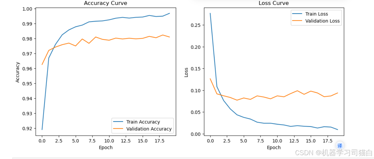
绘制准确率和损失曲线,可以看到随着epoch的增加,模型可能出现了过拟合,训练集的准确率高,而验证集的准确率低。或者训练集的损失小,而验证集的损失大。
七、模型评估
7.1 测试集评估
test_loss, test_acc = model.evaluate(x_test, y_test, verbose=0)
print(f"测试集准确率: {


       test_acc:.4f}")
print(f"测试集损失值: {


       test_loss:.4f}")
测试集准确率: 0.9833
测试集损失值: 0.0796
7.2 混淆矩阵分析
y_pred = model.predict(x_test)
y_pred_classes = np.argmax(y_pred, axis=1)
y_true = np.argmax(y_test, axis=1)

cm = confusion_matrix(y_true, y_pred_classes)

plt.figure(figsize=(10,8))
sns.heatmap(cm, annot=True, fmt='d', cmap='Blues')
plt.xlabel('Predicted')
plt.ylabel('True')
plt.title('Confusion Matrix')
plt.savefig('confusion_matrix.png', dpi=300)
plt.show()
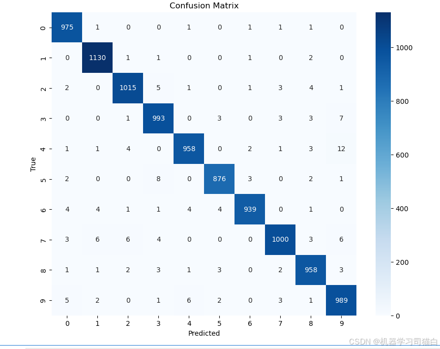
(1) 分类准确性
观察对角线上的值:
大多数的值都较大,说明分类器对这些类别的预测准确率较高。
例如,数字 “1” 的分类效果很好,1130 次分类中只有少量误分类。
其他类别,如 “0”(975次)、“3”(993次)等,也有较高的正确分类次数。
(2) 主要错误分类
观察非对角线的数值,较大的值表示分类器更容易把某个数字误判为另一个数字:
数字 “4” 误判为 “9” (12 次),说明模型在区分 “4” 和 “9” 方面可能有困难。
数字 “3” 误判为 “9” (7 次),可能是因为它们的形状相似。
数字 “6” 误判为 “4” (4 次),可能是因为部分书写方式导致的混淆。
数字 “8” 误判为 “3”、“5”,也有一些误分类。
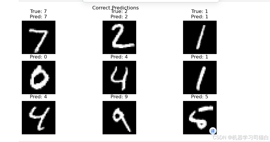
八、预测结果可视化
8.1 正确预测示例
correct_idx = np.where(y_pred_classes == y_true)[0]

plt.figure(figsize=(10,5))
for i, idx in enumerate(correct_idx[:9]):
    plt.subplot(3,3,i+1)
    plt.imshow(x_test[idx].reshape(28,28), cmap='gray')
    plt.title(f"True: {


       y_true[idx]}\nPred: {


       y_pred_classes[idx]}")
    plt.axis('off')
plt.suptitle('Correct Predictions')
plt.savefig('correct_predictions.png', dpi=300)
plt.show()
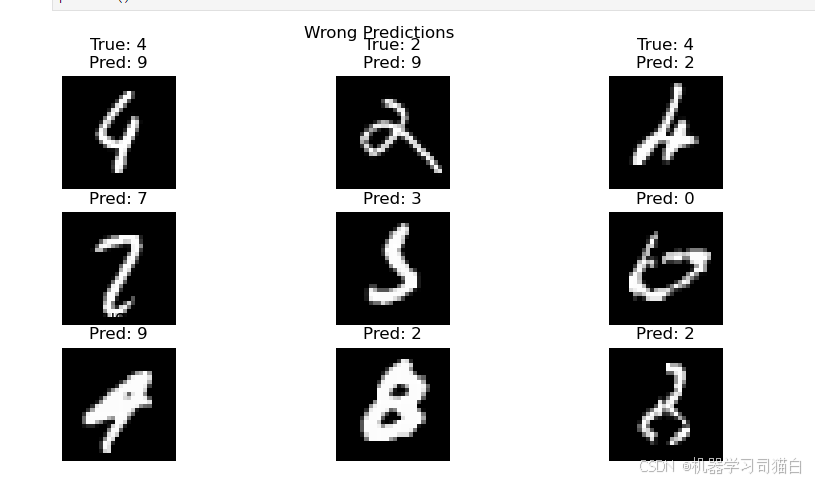
8.2 错误预测示例
wrong_idx = np.where(y_pred_classes != y_true)[0]

plt.figure(figsize=(10,5))
for i, idx in enumerate(wrong_idx[:9]):
    plt.subplot(3,3,i+1)
    plt.imshow(x_test[idx].reshape(28,28), cmap='gray')
    plt.title(f"True: {


       y_true[idx]}\nPred: {


       y_pred_classes[idx]}")
    plt.axis('off')
plt.suptitle('Wrong Predictions')
plt.savefig('wrong_predictions.png', dpi=300)
plt.show()
十、优化建议
- 尝试卷积神经网络(CNN)
- 增加数据增强(旋转、平移)
- 使用学习率衰减策略
- 调整网络深度与宽度
- 添加Batch Normalization层
今天的分享就到这里

汇聚全球AI编程工具,助力开发者即刻编程。
更多推荐

 23
23 0
0- 0


 已为社区贡献1条内容

所有评论(0)