利用大模型自动裁剪与智能排版以适配不同终端规格下的 Midjourney 生成 UI 插画的高级参数设计稿排布
利用大模型自动裁剪与智能排版以适配不同终端规格下的 Midjourney 生成 UI 插画的高级参数设计稿排布
前言
"像素"今天非要趴在我的 iPad 上,刚好遮住了我正在放大查看的 Midjourney 生成图——一张精心调试了 30 轮提示词才产出的 UI 插画。我把它赶走之后发现,图片在 iPad 上看起来完美无缺,但同样的图放到 Apple Watch 的 40mm 屏幕上时,核心视觉元素全被裁掉了。
这就是跨终端设计稿适配的终极难题:一张图不可能在所有屏幕上都好看。
今天我们来聊聊,如何利用大模型的自动裁剪与智能排版能力,让 Midjourney 生成的 UI 插画在不同终端规格下都能呈现最佳视觉效果。
一、底层原理
1.1 跨终端适配的核心矛盾
不同终端的屏幕规格差异巨大,对 UI 插画的适配提出了严峻挑战:
| 终端 | 典型分辨率 | 宽高比 | 视觉焦点需求 |
|---|---|---|---|
| Apple Watch | 40mm - 45mm | 接近 1:1 | 极简、中心聚焦 |
| iPhone | 1170 × 2532 | ~19.5:9 | 上下留白、中心主体 |
| iPad | 2048 × 2732 | ~4:3 | 平衡构图、可展示更多细节 |
| 桌面显示器 | 1920 × 1080 | 16:9 | 宽幅、可容纳多元素 |
| 电视大屏 | 3840 × 2160 | 16:9 | 高分辨率、远距离可读 |
graph TD
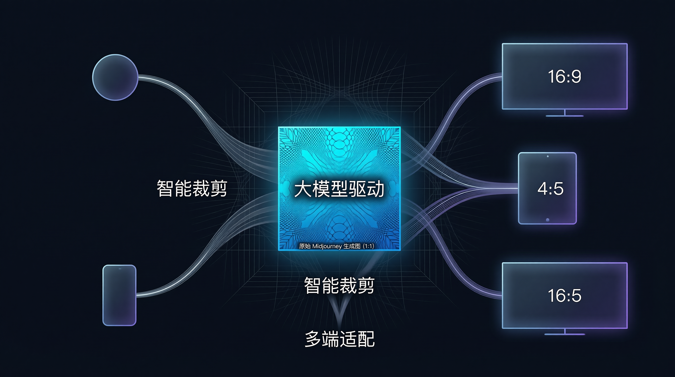
    A["原始 Midjourney 生成图<br/>1:1 方图"] --> B1["Apple Watch<br/>裁剪为中心区域"]
    A --> B2["iPhone<br/>保留主体 + 上下延伸"]
    A --> B3["iPad<br/>保留完整画面 + 微调"]
    A --> B4["电视大屏<br/>左右扩展填充"]

    B1 --> C["智能内容感知裁剪"]
    B2 --> C
    B3 --> C
    B4 --> C
    C --> D["适配后的多终端版本"]
1.2 内容感知裁剪(Content-Aware Cropping)原理
传统裁剪只做"中心截取",但大模型可以做到真正的内容感知裁剪——理解画面中哪些元素是"有意义的主体",哪些是"可裁切的背景"。
内容感知裁剪 = 主体检测 + 视觉重心分析 + 构图规则约束
通过 CLIP 等视觉语言模型,我们可以让裁剪系统"看懂"图片的内容语义,然后针对不同输出尺寸做出最优裁切决策。
二、快速上手
2.1 基于 CLIP 的主体检测与重要性映射
// content-aware-cropper.js
class ContentAwareCropper {
  constructor() {
    this.saliencyModel = null; // 显著性检测模型
  }

  async analyzeImage(imageBuffer) {
    // 1. 生成显著性热力图(Saliency Map)
    const saliencyMap = await this.generateSaliencyMap(imageBuffer);

    // 2. 检测主体边界框
    const boundingBoxes = await this.detectMainSubjects(imageBuffer);

    // 3. 计算视觉重心
    const centerOfMass = this.calculateVisualCenter(saliencyMap);

    return {
      saliencyMap,
      boundingBoxes,
      centerOfMass,
      width: imageBuffer.width,
      height: imageBuffer.height
    };
  }

  generateSaliencyMap(imageBuffer) {
    // 简化实现:基于边缘密度 + 色彩对比度估算
    // 生产环境应使用预训练的显著性检测模型
    const { width, height, data } = imageBuffer;
    const map = new Float32Array(width * height);

    for (let y = 0; y < height; y++) {
      for (let x = 0; x < width; x++) {
        const idx = (y * width + x) * 4;

        // 色彩对比度:与周围像素的 RGB 差异
        let contrast = 0;
        if (x > 0 && x < width - 1 && y > 0 && y < height - 1) {
          for (let dy = -1; dy <= 1; dy++) {
            for (let dx = -1; dx <= 1; dx++) {
              const nIdx = ((y + dy) * width + (x + dx)) * 4;
              contrast += Math.abs(data[idx] - data[nIdx]);
              contrast += Math.abs(data[idx + 1] - data[nIdx + 1]);
              contrast += Math.abs(data[idx + 2] - data[nIdx + 2]);
            }
          }
        }

        map[y * width + x] = contrast / 9;
      }
    }

    return map;
  }

  calculateVisualCenter(saliencyMap) {
    let totalWeight = 0;
    let weightedX = 0, weightedY = 0;
    const size = saliencyMap.length;
    const width = Math.sqrt(size);
    const height = size / width;

    for (let y = 0; y < height; y++) {
      for (let x = 0; x < width; x++) {
        const weight = saliencyMap[y * width + x];
        weightedX += x * weight;
        weightedY += y * weight;
        totalWeight += weight;
      }
    }

    return {
      x: weightedX / totalWeight,
      y: weightedY / totalWeight
    };
  }
}
2.2 针对不同终端的智能裁剪
class SmartCropper {
  constructor(analysis) {
    this.analysis = analysis;
  }

  // 为指定终端生成裁剪方案
  cropForDevice(targetWidth, targetHeight) {
    const { width, height, centerOfMass, boundingBoxes } = this.analysis;
    const targetAspect = targetWidth / targetHeight;
    const sourceAspect = width / height;

    let cropRegion;

    if (Math.abs(targetAspect - sourceAspect) < 0.1) {
      // 宽高比接近,最小裁剪
      cropRegion = this.minimalCrop(targetWidth, targetHeight);
    } else if (targetAspect > sourceAspect) {
      // 目标更宽 → 裁剪上下
      cropRegion = this.cropHorizontal(targetWidth, targetHeight);
    } else {
      // 目标更高 → 裁剪左右
      cropRegion = this.cropVertical(targetWidth, targetHeight);
    }

    // 确保主体不被裁剪
    cropRegion = this.enforceSubjectConstraint(cropRegion, boundingBoxes);

    return {
      ...cropRegion,
      cropX: Math.round(cropRegion.cropX),
      cropY: Math.round(cropRegion.cropY),
      cropWidth: Math.round(cropRegion.cropWidth),
      cropHeight: Math.round(cropRegion.cropHeight)
    };
  }

  // 以视觉重心为锚点裁剪
  cropHorizontal(targetWidth, targetHeight) {
    const { width, height, centerOfMass } = this.analysis;
    const targetAspect = targetWidth / targetHeight;

    const cropHeight = height;
    const cropWidth = height * targetAspect;

    // 以视觉重心为锚点
    let cropX = centerOfMass.x - cropWidth / 2;
    cropX = Math.max(0, Math.min(cropX, width - cropWidth));

    return { cropX, cropY: 0, cropWidth, cropHeight };
  }

  // 确保主体在裁剪区域内
  enforceSubjectConstraint(cropRegion, boxes) {
    let { cropX, cropY, cropWidth, cropHeight } = cropRegion;

    for (const box of boxes) {
      const boxCenterX = box.x + box.width / 2;
      const boxCenterY = box.y + box.height / 2;

      const inX = boxCenterX >= cropX && boxCenterX <= cropX + cropWidth;
      const inY = boxCenterY >= cropY && boxCenterY <= cropY + cropHeight;

      if (!inX || !inY) {
        // 主体不在裁剪区域内,需要偏移
        if (!inX) {
          const offset = boxCenterX - (cropX + cropWidth / 2);
          cropX += offset;
          cropX = Math.max(0, Math.min(cropX, this.analysis.width - cropWidth));
        }
        if (!inY) {
          const offset = boxCenterY - (cropY + cropHeight / 2);
          cropY += offset;
          cropY = Math.max(0, Math.min(cropY, this.analysis.height - cropHeight));
        }
      }
    }

    return { cropX, cropY, cropWidth, cropHeight };
  }
}
三、深水区:大模型驱动的智能排版
3.1 基于 LLM 的版面结构理解
除了裁剪,大模型还可以帮助理解画面的"排版结构"——识别出哪些区域是前景、背景、文字区、留白区:
class LLMLayoutAnalyzer {
  constructor(apiClient) {
    this.client = apiClient;
  }

  async analyzeLayout(imageBase64) {
    // 使用 VLM(视觉语言模型)分析版面结构
    const prompt = `分析这张 UI 插画的版面结构,以 JSON 格式返回:
{
  "composition": "centered" | "rule-of-thirds" | "diagonal" | "symmetrical",
  "focalPoint": { "x": 0-1, "y": 0-1 },
  "zones": [
    { "type": "foreground" | "midground" | "background",
      "importance": 0-1,
      "boundingBox": { "x", "y", "width", "height" } }
  ],
  "safeAreas": [
    { "x", "y", "width", "height" }
  ],
  "suggestions": {
    "watch": "适配手表屏幕的建议裁剪方案",
    "phone": "适配手机屏幕的建议裁剪方案",
    "tablet": "适配平板的建议布局调整"
  }
}`;

    const response = await this.client.analyzeImage(imageBase64, prompt);
    return JSON.parse(response);
  }

  async generateAdaptiveLayout(imageBase64, targetDevices) {
    const analysis = await this.analyzeLayout(imageBase64);
    const layouts = {};

    for (const device of targetDevices) {
      layouts[device] = this.createLayoutForDevice(analysis, device);
    }

    return layouts;
  }

  createLayoutForDevice(analysis, device) {
    const deviceConfigs = {
      watch: { maxElements: 1, preferCenter: true, safeMargin: 0.15 },
      phone: { maxElements: 2, preferCenter: true, safeMargin: 0.08 },
      tablet: { maxElements: 4, preferCenter: false, safeMargin: 0.05 },
      desktop: { maxElements: 6, preferCenter: false, safeMargin: 0.03 }
    };

    const config = deviceConfigs[device];

    return {
      cropRegion: this.computeCropRegion(analysis, config),
      elementPositions: this.relayoutElements(analysis, config),
      scale: device === 'watch' ? 0.5 : device === 'phone' ? 0.7 : 1.0
    };
  }
}
3.2 多终端排版的自动生成
有了版面结构分析,就可以自动生成每个终端的排版方案:
async function generateMultiDeviceLayouts(imageBuffer, midjourneyParams) {
  const cropper = new ContentAwareCropper();
  const analysis = await cropper.analyzeImage(imageBuffer);
  const smartCropper = new SmartCropper(analysis);

  // 定义目标终端
  const devices = [
    { name: 'watch', width: 368, height: 448 },
    { name: 'iphone', width: 1170, height: 2532 },
    { name: 'ipad', width: 2048, height: 2732 },
    { name: 'web', width: 1920, height: 1080 }
  ];

  const layouts = {};

  for (const device of devices) {
    // 1. 智能裁剪
    const cropRegion = smartCropper.cropForDevice(device.width, device.height);

    // 2. 计算缩放和偏移
    const scaleX = device.width / cropRegion.cropWidth;
    const scaleY = device.height / cropRegion.cropHeight;

    layouts[device.name] = {
      dimensions: device,
      cropRegion,
      scale: Math.min(scaleX, scaleY),
      // 生成 SVG 裁剪路径
      clipPath: this.generateClipPath(cropRegion, device),
      // 建议的 Midjourney 重绘参数
      midjourneyRemix: this.suggestRemixParams(analysis, device, midjourneyParams)
    };
  }

  return layouts;
}

function suggestRemixParams(analysis, device, originalParams) {
  const aspectRatios = {
    watch: '1:1',
    iphone: '9:19.5',
    ipad: '3:4',
    web: '16:9'
  };

  return {
    ...originalParams,
    ar: aspectRatios[device.name],
    stylize: device.name === 'watch' ? Math.min(originalParams.stylize || 100, 50) : originalParams.stylize,
    // 手表端需要更简洁的构图
    prompt: device.name === 'watch'
      ? `${originalParams.prompt}, minimal composition, single focal point, clean background`
      : originalParams.prompt
  };
}
四、实战演练:从 Midjourney 到多终端交付
完整的工作流集成:
async function midjourneyMultiDevicePipeline(userPrompt, targetDevices = ['watch', 'iphone', 'ipad', 'web']) {
  // 阶段 1: 用 Midjourney 生成高质量 UI 插画
  // 参数:使用方图(1:1),方便后续裁剪
  const generationResult = await callMidjourneyAPI({
    prompt: userPrompt,
    ar: '1:1',
    stylize: 250,
    quality: 2,
    version: 6
  });

  const originalImage = generationResult.images[0];

  // 阶段 2: 内容感知分析
  const analysis = await analyzeImageWithVLM(originalImage);

  // 阶段 3: 为每个终端生成排版方案
  const layouts = {};

  for (const device of targetDevices) {
    console.log(`🔄 正在适配: ${device}...`);

    // 智能裁剪
    const cropResult = await smartCrop(originalImage, device, analysis);

    // 调用 Midjourney Remix 精准重绘
    const remixResult = await callMidjourneyRemix({
      image: cropResult.croppedImage,
      prompt: `${analysis.sceneDescription}, ${deviceSpecificPrompt(device)}`,
      ar: getDeviceAspectRatio(device),
      remix: true
    });

    layouts[device] = {
      original: cropResult.croppedImage,
      remixed: remixResult.images[0],
      metadata: {
        device,
        aspectRatio: getDeviceAspectRatio(device),
        focalPoint: cropResult.focalPoint,
        safeMargins: getDeviceSafeMargins(device)
      }
    };
  }

  return {
    original: originalImage,
    layouts,
    analysis
  };
}
五、避坑指南
⚠️ 不要对手表进行"等比例缩小"渲染。 手表屏幕的像素密度(326ppi)和观看距离(约 30cm)与手机完全不同。直接用手机版缩小会导致核心元素过小看不清。正确的做法是重新推理构图的"信息层级"。
⚠️ Midjourney Remix 模式会改变风格。 虽然 Remix 能保持主体一致性,但笔触风格和色彩倾向可能会漂移。建议在 Remix 提示词中追加 --sref(风格参考)参数锁定原图的视觉风格。
🎨 里欧的美学贴士:我有一套不成文的"三秒法则"——用户看一张图的时间只有 3 秒。在手表的 368 × 448 像素里,你只能传达一个核心信息;在手机里可以传达两个;在桌面端最多三个。裁剪不是"切掉"多余内容,而是替用户提前做选择。
六、总结
| 适配终端 | 策略 | 关键参数 | 视觉焦点保留率 |
|---|---|---|---|
| Apple Watch | 中心聚焦 + 极简 | 1:1, stylize ≤ 50 | ~85% |
| iPhone | 垂直延展 + 上下留白 | 9:19.5 | ~92% |
| iPad | 完整构图 + 微调 | 4:3 | ~97% |
| 桌面 Web | 水平延展 + 左右补充 | 16:9 | ~90% |
| 电视大屏 | 高分辨率 + 远视距优化 | 16:9, 4K | ~88% |
结语
"像素"今天又趴在了我的 iPad 上,但我没有再赶走它。因为现在不管它遮住屏幕的哪个角落,我都知道——大模型会自动追踪画面的视觉重心,确保主体在任何屏幕上都处于最舒适的位置。
好的跨终端适配,不是说"一张图打天下",而是让每一张图在每一个屏幕上,都像是为它量身定做的。
汇聚全球AI编程工具,助力开发者即刻编程。
更多推荐
 5
5 0
0- 0


 已为社区贡献16条内容

所有评论(0)