
cursor、通义灵码和豆包生成圣诞树html网页代码
·
背景
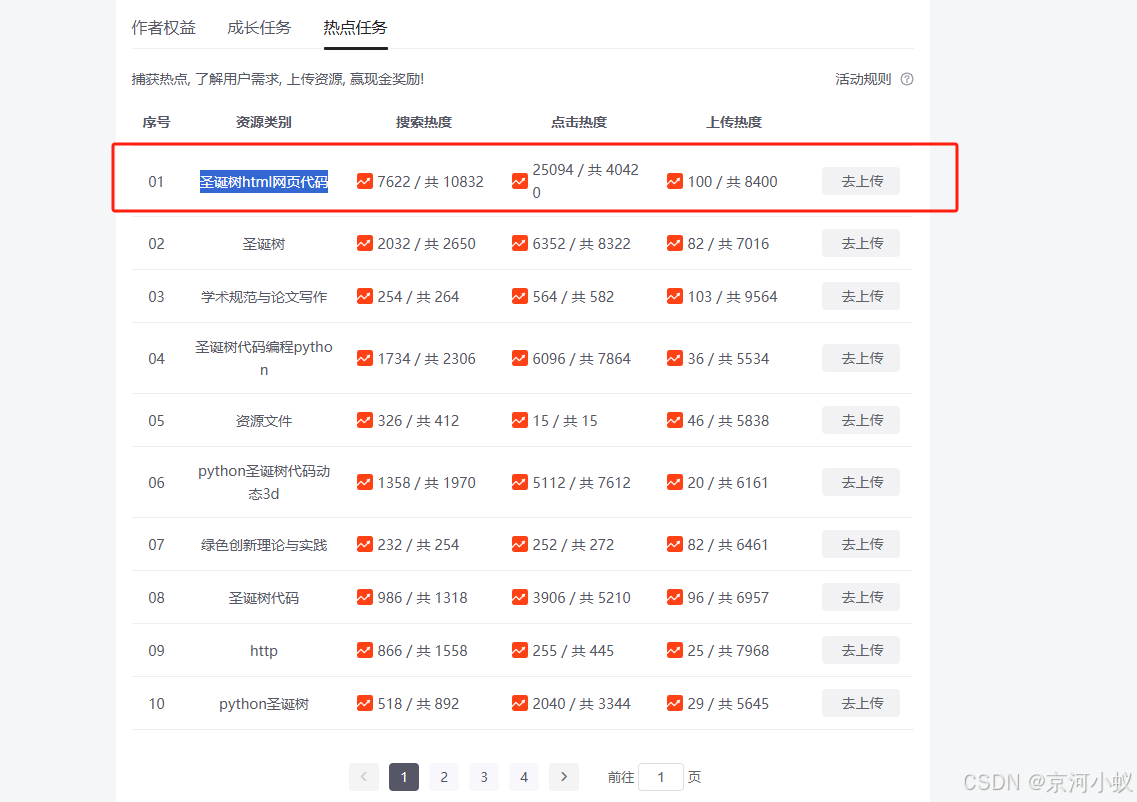
下面这张图是发这篇文章的初始原因,偶然间看到这个CSDN的热点任务,想要用AI辅助工具对比生成一份html文件,本篇文章只对比,没有结论,下面我把测试过程发出来。
对比过程
通义灵码
圣诞树html网页代码
<!DOCTYPE html>
<html>
<head>
    <title>圣诞树</title>
    <style>
        body {
            background-color: #000;
            color: #fff;
            display: flex;
            justify-content: center;
            align-items: center;
            height: 100vh;
            margin: 0;
        }
        .christmas-tree {
            font-size: 0;
        }
        .christmas-tree div {
            text-align: center;
            margin-bottom: -15px;
        }
        .christmas-tree span {
            display: inline-block;
            margin-bottom: 10px;
            color: green;
            font-size: 8px;
            width: 20px;
            height: 20px;
            line-height: 20px;
        }
        .star {
            color: yellow;
            font-size: 30px;
            margin-bottom: 10px;
        }
        .trunk {
            color: brown;
            font-size: 20px;
            margin-top: 10px;
        }
    </style>
</head>
<body>
    <div class="christmas-tree">
        <div class="star">*</div>
        <div><span>*</span></div>
        <div><span>*</span><span>*</span><span>*</span></div>
        <div><span>*</span><span>*</span><span>*</span><span>*</span><span>*</span></div>
        <div><span>*</span><span>*</span><span>*</span><span>*</span><span>*</span><span>*</span><span>*</span></div>
        <div class="trunk">|||</div>
    </div>
</body>
</html>
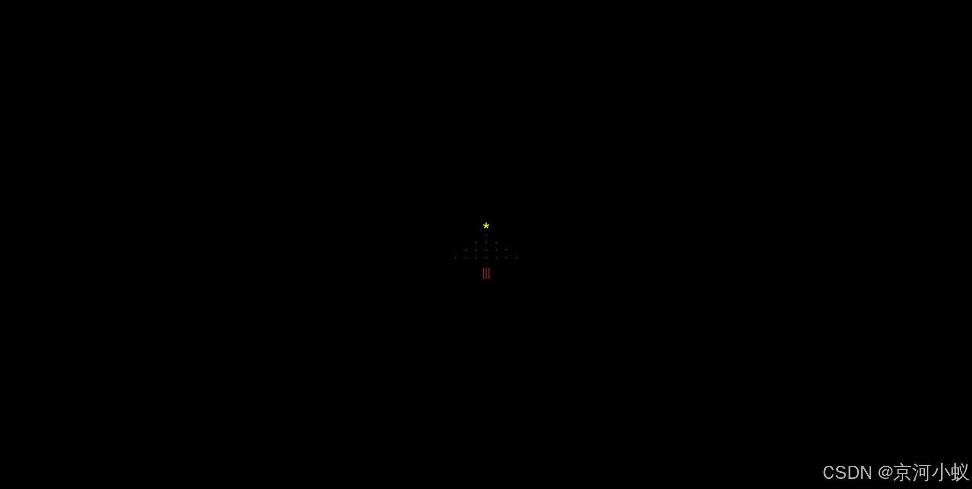
演示效果
豆包
圣诞树html网页代码
<!DOCTYPE html>
<html lang="en">

<head>
    <meta charset="UTF-8">
    <meta name="viewport" content="width=device-width, initial-scale=1.0">
    <title>绚丽闪烁的圣诞树</title>
    <style>
        /* 整体页面背景设置为淡蓝色,模拟冬日天空的感觉 */
        body {
            background-color: aliceblue;
            display: flex;
            justify-content: center;
            align-items: center;
            min-height: 100vh;
            margin: 0;
        }

        /* 圣诞树容器样式 */
        #christmas-tree {
            text-align: center;
        }

        /* 圣诞树文本样式 */
        #christmas-tree pre {
            font-family: Arial, sans-serif;
            font-size: 20px;
            line-height: 1.2;
            color: green;
            margin: 0;
            padding: 0;
        }

        /* 定义星星装饰的样式,模拟圣诞树上的星星 */
       .star {
            color: gold;
            font-size: 30px;
            margin-bottom: 10px;
            animation: twinkle 1s infinite;
        }

        /* 闪烁动画效果 */
        @keyframes twinkle {
            0% {
                opacity: 0.4;
            }

            50% {
                opacity: 1;
            }

            100% {
                opacity: 0.4;
            }
        }

        /* 定义彩灯装饰的样式 */
       .light {
            color: red;
            font-size: 15px;
            margin: 0 3px;
            animation: blink-light 1s infinite;
        }

        /* 彩灯闪烁动画效果 */
        @keyframes blink-light {
            0% {
                opacity: 0;
            }

            50% {
                opacity: 1;
            }

            100% {
                opacity: 0;
            }
        }

    </style>
    <script>
        window.onload = function () {
            const tree = document.getElementById('christmas-tree');
            const colors = ['green', 'lime', 'lightgreen', 'darkgreen', 'forestgreen'];
            let index = 0;

            function blink() {
                tree.style.color = colors[index];
                index = (index + 1) % colors.length;
                setTimeout(blink, 300);
            }

            blink();
        };
    </script>
</head>

<body>
    <div id="christmas-tree">
        <span class="star">★</span>
        <pre>
         * <span class="light">🎇</span>
        *** <span class="light">🎇</span>
       ***** <span class="light">🎇</span>
      ******* <span class="light">🎇</span>
     ********* <span class="light">🎇</span>
    *********** <span class="light">🎇</span>
   ************* <span class="light">🎇</span>
  *************** <span class="light">🎇</span>
 ***************** <span class="light">🎇</span>
******************* <span class="light">🎇</span>
        </pre>
    </div>
</body>

</html>
演示效果
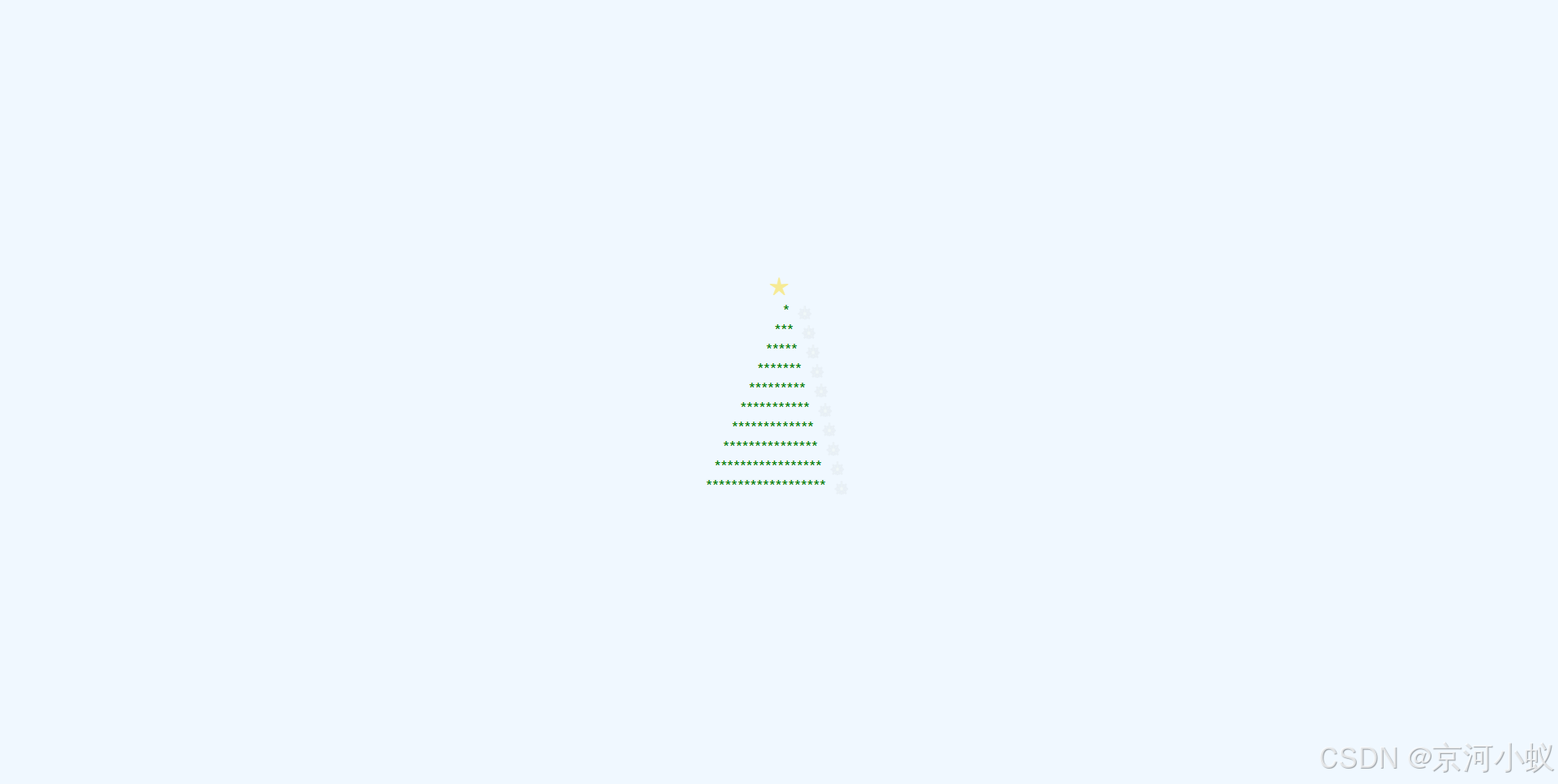
可以看到右侧有一个闪动的效果。
cursor
圣诞树html网页代码
<!DOCTYPE html>
<html>
<head>
    <meta charset="UTF-8">
    <title>圣诞快乐</title>
    <style>
        body {
            background: #0F222B;
            display: flex;
            justify-content: center;
            align-items: center;
            min-height: 100vh;
            margin: 0;
        }

        .tree {
            position: relative;
            width: 100px;
            height: 200px;
            transform-style: preserve-3d;
            animation: rotate 10s linear infinite;
        }

        .star {
            position: absolute;
            top: -20px;
            left: 45px;
            color: yellow;
            font-size: 24px;
            animation: twinkle 1s infinite;
        }

        .tree-body {
            position: absolute;
            width: 0;
            height: 0;
            border-left: 50px solid transparent;
            border-right: 50px solid transparent;
            border-bottom: 100px solid #0F4;
        }

        .tree-body:nth-child(2) {
            top: 60px;
        }

        .tree-body:nth-child(3) {
            top: 120px;
        }

        .trunk {
            position: absolute;
            bottom: -30px;
            left: 35px;
            width: 30px;
            height: 30px;
            background: #842;
        }

        .ball {
            position: absolute;
            width: 10px;
            height: 10px;
            border-radius: 50%;
            animation: twinkle 1s infinite;
        }

        @keyframes rotate {
            from { transform: rotateY(0deg); }
            to { transform: rotateY(360deg); }
        }

        @keyframes twinkle {
            0% { opacity: 0.3; }
            50% { opacity: 1; }
            100% { opacity: 0.3; }
        }
    </style>
</head>
<body>
    <div class="tree">
        <div class="star">★</div>
        <div class="tree-body"></div>
        <div class="tree-body"></div>
        <div class="tree-body"></div>
        <div class="trunk"></div>
        <div class="ball" style="top:40px; left:30px; background:red;"></div>
        <div class="ball" style="top:70px; left:60px; background:yellow;"></div>
        <div class="ball" style="top:100px; left:40px; background:blue;"></div>
        <div class="ball" style="top:130px; left:70px; background:purple;"></div>
    </div>
</body>
</html>
演示效果
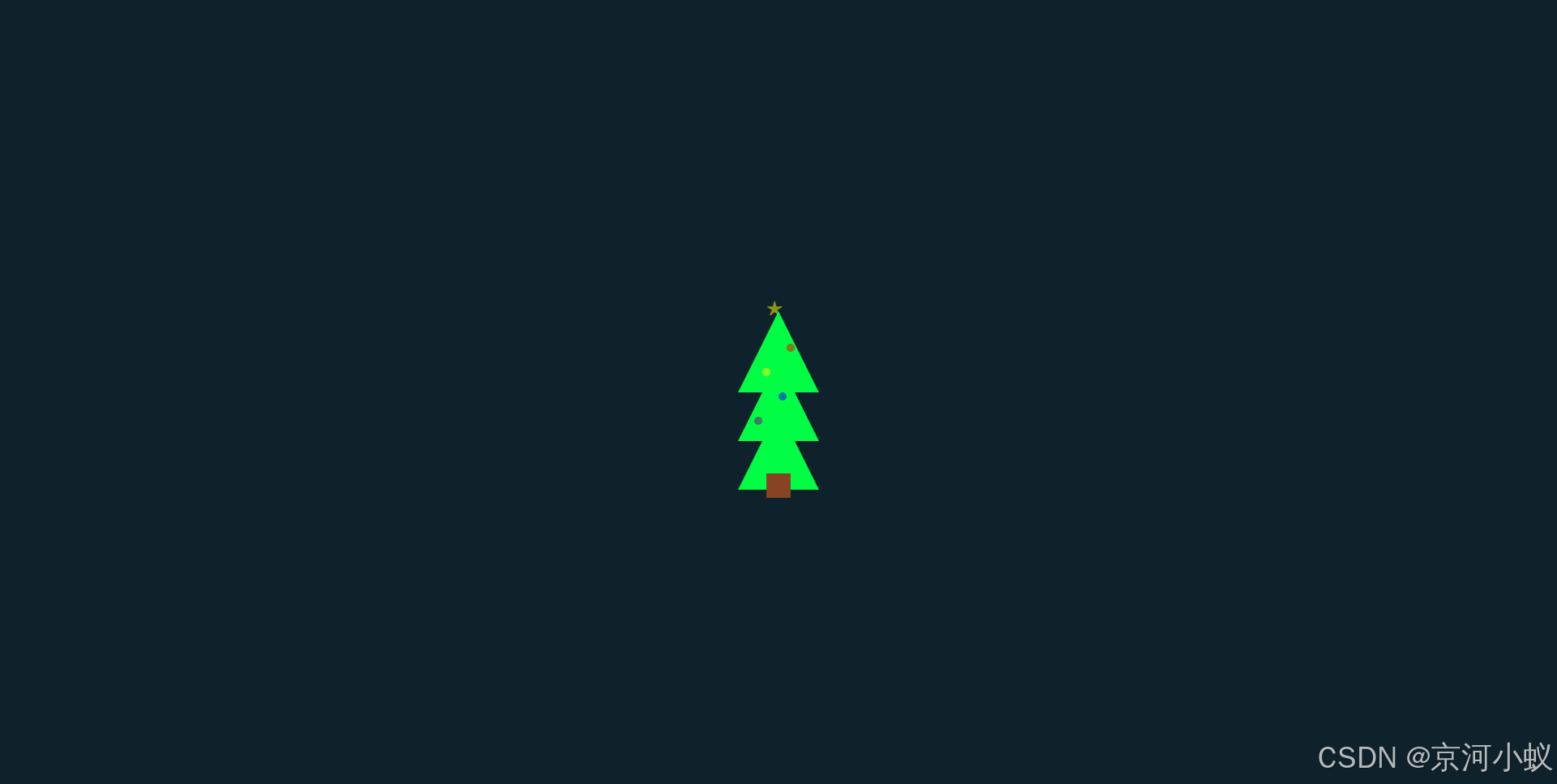
上面的树有一个旋转的效果。
资源上传成功

经过这个对比,
仁者见仁,智者见智吧!

汇聚全球AI编程工具,助力开发者即刻编程。
更多推荐
 16
16 0
0- 0


 已为社区贡献1条内容

所有评论(0)