
鸿蒙HarmonyOS ArkTS仪表盘布局深度学习:Grid + 卡片组合
项目演示
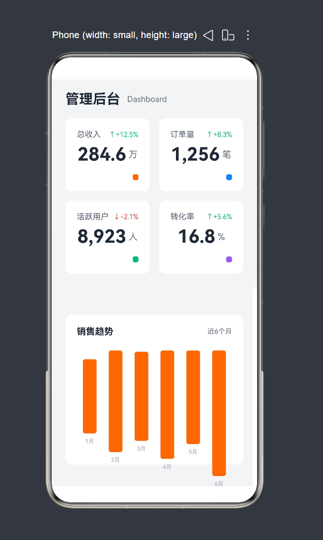
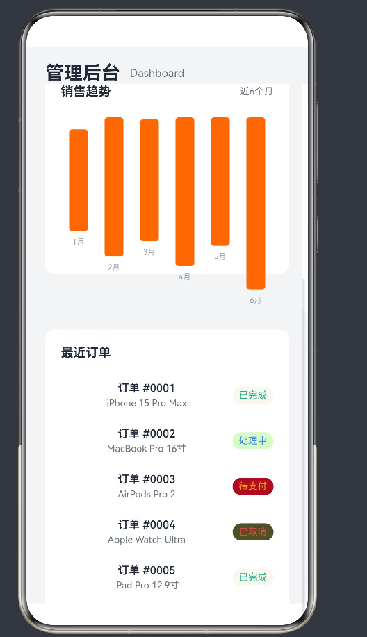
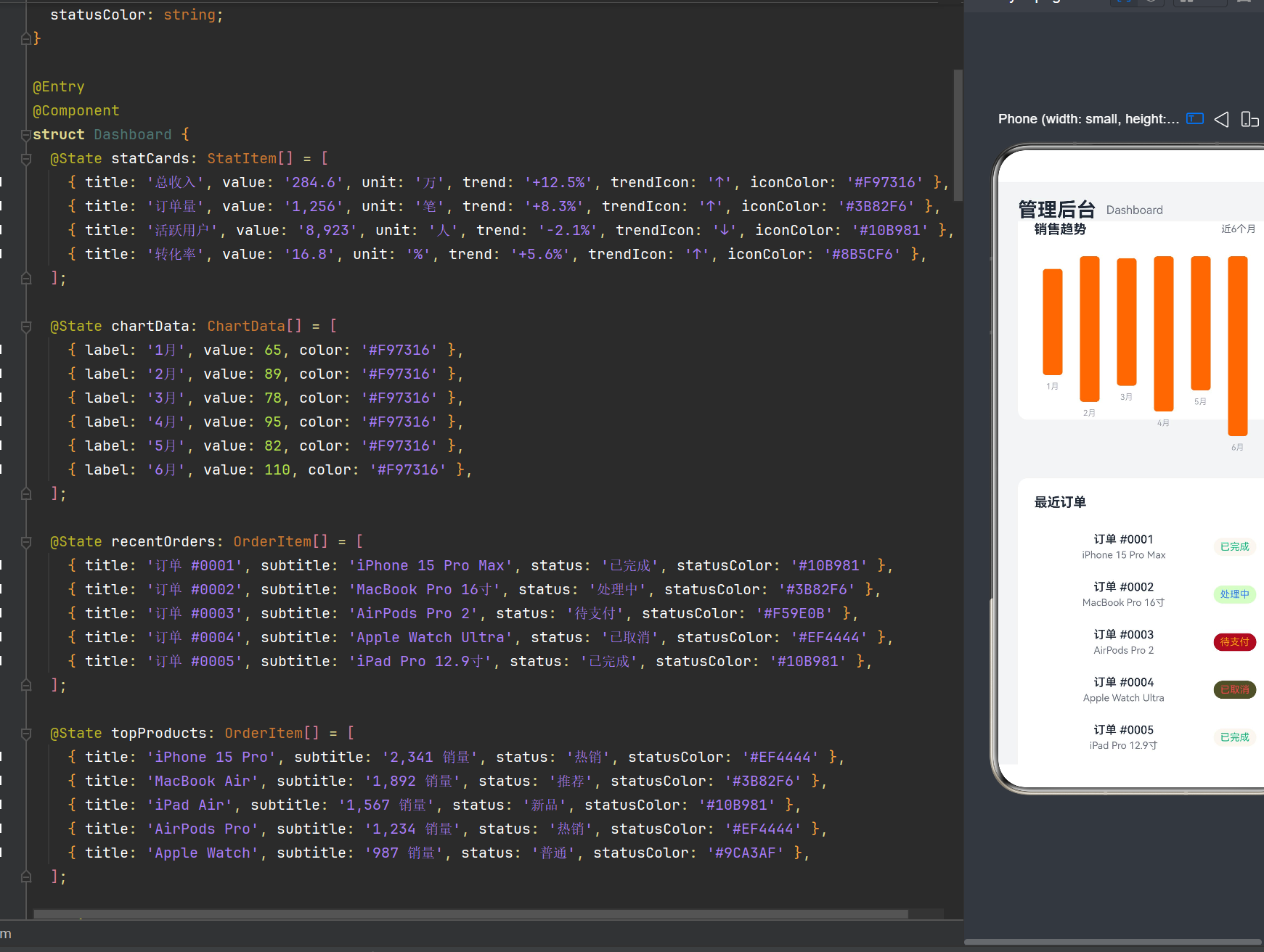
目录
- HarmonyOS NEXT 与 ArkTS 概述
- 仪表盘布局设计理念
- Grid 布局核心概念与 API
- 卡片组件设计模式
- 仪表盘布局实战:管理后台 Dashboard
- 响应式布局与多设备适配
- 状态管理与数据驱动
- @Builder 装饰器深度解析
- 性能优化策略
- 常见问题与解决方案
- 最佳实践总结
1. HarmonyOS NEXT 与 ArkTS 概述
1.1 HarmonyOS NEXT 简介
HarmonyOS NEXT 是华为推出的新一代智能终端操作系统,采用全新的分布式架构设计,支持手机、平板、智慧屏、智能穿戴等多种设备形态。HarmonyOS NEXT 引入了 ArkTS 语言和 ArkUI 声明式 UI 框架,为开发者提供了高效、简洁的应用开发体验。
1.2 ArkTS 语言特性
ArkTS 是基于 TypeScript 扩展的声明式 UI 开发语言,保留了 TypeScript 的类型安全特性,同时增加了声明式 UI 语法、状态管理装饰器等面向 UI 开发的特性。
核心特性:
- 声明式语法:通过描述 UI 状态而非命令式操作来构建界面
- 类型安全:完整的 TypeScript 类型系统支持
- 状态管理:
@State、@Prop、@Link等装饰器实现响应式状态更新 - 组件化开发:
@Component、@Entry装饰器构建可复用组件 - 生命周期管理:组件生命周期回调机制
1.3 ArkUI 组件框架
ArkUI 提供了丰富的 UI 组件库,包括基础组件(Text、Image、Button)、容器组件(Column、Row、Stack)、滚动组件(Scroll、List)、网格组件(Grid)等。这些组件采用声明式方式组合,形成灵活的布局结构。
2. 仪表盘布局设计理念
2.1 仪表盘布局的应用场景
仪表盘(Dashboard)是管理后台、数据分析类应用的核心界面,用于集中展示关键业务指标、数据趋势和操作入口。典型的仪表盘布局具有以下特点:
- 信息密集:在有限空间内展示多个数据维度
- 层次分明:通过卡片分区,突出重点信息
- 可视化丰富:结合图表、进度条等可视化组件
- 响应式适配:适配不同屏幕尺寸和设备类型
2.2 Grid + 卡片组合布局模式
Grid + 卡片组合是构建仪表盘的经典布局模式:
- Grid 布局:提供网格化的空间划分,实现响应式的多列布局
- 卡片组件:将相关数据封装为独立的卡片单元,便于维护和复用
- 灵活组合:通过 Grid 的行列配置,实现不同尺寸卡片的自由组合
2.3 设计原则
- 一致性:统一的卡片样式、间距和视觉风格
- 可读性:清晰的信息层级和数据呈现
- 交互性:支持卡片点击、hover 等交互效果
- 性能优化:虚拟滚动、懒加载等优化策略
3. Grid 布局核心概念与 API
3.1 Grid 组件概述
Grid 是 ArkUI 提供的网格布局组件,用于在二维网格中排列子组件。Grid 支持灵活的行列配置、间距设置和对齐方式,是构建仪表盘布局的核心组件。
3.2 Grid 核心属性
3.2.1 行列配置
Grid() {
  // 子组件
}
.columnsTemplate('1fr 1fr')  // 列模板,定义每列宽度
.rowsTemplate('auto auto')    // 行模板,定义每行高度
.columnsGap(16)               // 列间距
.rowsGap(16)                  // 行间距
列模板语法:
1fr:等分剩余空间100vp:固定宽度auto:自适应内容宽度- 组合使用:
'1fr 2fr 1fr'表示三列,中间列宽度是两侧的两倍
3.2.2 对齐方式
Grid() {
  // 子组件
}
.alignContent(AlignContent.Center)  // 内容区域在容器中的对齐方式
.alignItems(AlignItems.Center)      // 子组件在单元格中的垂直对齐
.justifyItems(JustifyItems.Center)  // 子组件在单元格中的水平对齐
3.2.3 滚动与分页
Grid() {
  // 子组件
}
.scrollBar(BarState.On)             // 滚动条状态
.scrollable(ScrollDirection.Vertical)  // 滚动方向
.maxCount(6)                        // 最大显示数量(分页模式)
3.3 GridItem 组件
GridItem 是 Grid 的直接子组件,用于定义每个网格单元的内容。GridItem 支持跨行列合并:
Grid() {
  GridItem() {
    Text('跨两行')
  }
  .rowSpan(2)  // 跨两行

  GridItem() {
    Text('跨两列')
  }
  .columnSpan(2)  // 跨两列
}
3.4 Grid API 完整列表(API 24)
| 属性 | 类型 | 说明 |
|---|---|---|
columnsTemplate | string | 列模板配置 |
rowsTemplate | string | 行模板配置 |
columnsGap | number | string | 列间距 |
rowsGap | number | string | 行间距 |
width | number | string | 容器宽度 |
height | number | string | 容器高度 |
alignContent | AlignContent | 内容区域对齐 |
alignItems | AlignItems | 子组件垂直对齐 |
justifyItems | JustifyItems | 子组件水平对齐 |
scrollable | ScrollDirection | 滚动方向 |
scrollBar | BarState | 滚动条状态 |
maxCount | number | 最大显示数量 |
cachedCount | number | 缓存数量(性能优化) |
GridItem 属性:
| 属性 | 类型 | 说明 |
|---|---|---|
rowSpan | number | 跨行数量 |
columnSpan | number | 跨列数量 |
forceRebuild | boolean | 是否强制重建 |
4. 卡片组件设计模式
4.1 卡片组件的定义
卡片组件是仪表盘布局中的基本单元,用于封装一组相关数据的展示。卡片通常包含以下元素:
- 标题区域:卡片主题名称
- 内容区域:核心数据或图表
- 操作区域:按钮、链接等交互元素
- 视觉样式:背景、边框、阴影、圆角
4.2 卡片组件的实现方式
在 ArkTS 中,卡片组件有两种实现方式:
方式一:@Builder 构建器
@Builder
BuildStatCard(title: string, value: string) {
  Column() {
    Text(title)
      .fontSize(14)
      .fontColor('#6B7280');
    Text(value)
      .fontSize(24)
      .fontWeight(FontWeight.Bold);
  }
  .width('100%')
  .padding(20)
  .backgroundColor(Color.White)
  .borderRadius(12)
  .shadow({ radius: 8, color: '#00000010', offsetY: 4 });
}
优点:代码简洁,适合简单卡片
缺点:无法独立复用,只能在当前组件中调用
方式二:@Component 组件
@Component
struct StatCard {
  @Prop title: string;
  @Prop value: string;

  build() {
    Column() {
      Text(this.title)
        .fontSize(14)
        .fontColor('#6B7280');
      Text(this.value)
        .fontSize(24)
        .fontWeight(FontWeight.Bold);
    }
    .width('100%')
    .padding(20)
    .backgroundColor(Color.White)
    .borderRadius(12)
    .shadow({ radius: 8, color: '#00000010', offsetY: 4 });
  }
}
优点:可独立复用,支持 props 传递
缺点:代码相对冗长
4.3 卡片样式设计规范
尺寸规范:
- 卡片内边距:16-24 vp
- 卡片圆角:8-16 vp
- 卡片阴影:柔和的投影效果
- 卡片间距:16 vp
颜色规范:
- 背景色:白色或浅灰色
- 标题颜色:中等灰色(#6B7280)
- 内容颜色:深色(#1F2937)
- 辅助信息:浅色(#9CA3AF)
4.4 卡片类型分类
根据仪表盘的需求,常见的卡片类型包括:
- 统计卡片:展示关键指标数值
- 图表卡片:展示数据趋势和图表
- 列表卡片:展示数据列表
- 状态卡片:展示业务状态
- 操作卡片:提供操作入口
5. 仪表盘布局实战:管理后台 Dashboard
5.1 需求分析
我们将构建一个电商管理后台的仪表盘页面,包含以下模块:
- 顶部导航:页面标题和面包屑
- 统计指标:总收入、订单量、活跃用户、转化率
- 销售趋势:近6个月销售数据柱状图
- 热门商品:销量排名前5的商品列表
- 最近订单:最新订单列表及状态
5.2 数据模型设计
interface StatItem {
  title: string;
  value: string;
  unit: string;
  trend: string;
  trendIcon: string;
  iconColor: string;
}

interface ChartData {
  label: string;
  value: number;
  color: string;
}

interface OrderItem {
  title: string;
  subtitle: string;
  status: string;
  statusColor: string;
}
设计要点:
- 使用
interface定义数据结构,确保类型安全 - 避免使用
any类型,明确每个字段的类型 - 颜色使用十六进制字符串,便于样式管理
5.3 页面组件结构
@Entry
@Component
struct Dashboard {
  // 状态数据
  @State statCards: StatItem[] = [...];
  @State chartData: ChartData[] = [...];
  @State recentOrders: OrderItem[] = [...];
  @State topProducts: OrderItem[] = [...];

  // 构建器方法
  @Builder BuildStatCard(stat: StatItem) { ... }
  @Builder BuildChartCard() { ... }
  @Builder BuildListCard(title: string, items: OrderItem[]) { ... }

  // 主构建方法
  build() {
    Column() {
      // 顶部导航
      // 滚动区域
      Scroll() {
        Column() {
          // 统计卡片 Grid
          // 图表与热门商品 Row
          // 最近订单卡片
        }
      }
    }
  }
}
5.4 统计卡片构建器详解
@Builder
BuildStatCard(stat: StatItem) {
  Column() {
    // 第一行:标题和趋势
    Row() {
      Text(stat.title)
        .fontSize(14)
        .fontColor('#6B7280')
        .fontWeight(FontWeight.Medium);
      Row() {
        Text(stat.trendIcon)
          .fontSize(12)
          .fontColor(stat.trend.startsWith('+') ? '#10B981' : '#EF4444');
        Text(stat.trend)
          .fontSize(12)
          .fontColor(stat.trend.startsWith('+') ? '#10B981' : '#EF4444');
      }
    }
    .width('100%')
    .justifyContent(FlexAlign.SpaceBetween);

    // 第二行:数值和单位
    Row() {
      Text(stat.value)
        .fontSize(32)
        .fontWeight(FontWeight.Bold)
        .fontColor('#1F2937');
      Text(stat.unit)
        .fontSize(16)
        .fontColor('#6B7280')
        .margin({ left: 4 });
    }
    .margin({ top: 8 });

    // 第三行:图标占位
    Row() {
      Column()
        .width(10)
        .height(10)
        .backgroundColor(stat.iconColor)
        .borderRadius(3);
    }
    .width('100%')
    .justifyContent(FlexAlign.End)
    .margin({ top: 16 });
  }
  .width('100%')
  .padding({ left: 20, right: 20, top: 20, bottom: 20 })
  .backgroundColor(Color.White)
  .borderRadius(12)
  .shadow({ radius: 8, color: '#00000010', offsetY: 4 });
}
布局要点:
- 使用
Column作为卡片容器,内部元素垂直排列 - 第一行使用
Row+justifyContent(FlexAlign.SpaceBetween)实现标题和趋势的两端对齐 - 趋势颜色根据正负值动态判断(绿色表示增长,红色表示下降)
- 数值使用大字号和粗体突出显示
- 卡片样式包含白色背景、圆角和阴影效果
5.5 图表卡片构建器详解
@Builder
BuildChartCard() {
  Column() {
    // 标题区域
    Row() {
      Text('销售趋势')
        .fontSize(16)
        .fontWeight(FontWeight.Bold)
        .fontColor('#1F2937');
      Text('近6个月')
        .fontSize(12)
        .fontColor('#6B7280');
    }
    .width('100%')
    .justifyContent(FlexAlign.SpaceBetween);

    // 图表区域
    Column() {
      Row() {
        ForEach(this.chartData, (item: ChartData) => {
          Column() {
            // 柱状图
            Column()
              .width(24)
              .height(item.value * 2)
              .backgroundColor(item.color)
              .borderRadius(4)
              .alignSelf(ItemAlign.Center);
            // 标签
            Text(item.label)
              .fontSize(10)
              .fontColor('#9CA3AF')
              .margin({ top: 8 });
          }
          .flexGrow(1);
        })
      }
      .width('100%')
      .height(180)
      .margin({ top: 24 });
    }
    .width('100%');
  }
  .width('100%')
  .padding({ left: 20, right: 20, top: 20, bottom: 20 })
  .backgroundColor(Color.White)
  .borderRadius(12)
  .shadow({ radius: 8, color: '#00000010', offsetY: 4 });
}
布局要点:
- 使用
ForEach遍历图表数据,动态生成柱状图 - 柱状图高度根据数据值动态计算(
item.value * 2) - 使用
flexGrow(1)确保每个柱状图等分可用空间 - 图表容器设置固定高度
180,保证图表区域的稳定性
5.6 列表卡片构建器详解
@Builder
BuildListCard(title: string, items: OrderItem[]) {
  Column() {
    // 标题
    Text(title)
      .fontSize(16)
      .fontWeight(FontWeight.Bold)
      .fontColor('#1F2937')
      .width('100%');

    // 列表内容
    Column() {
      ForEach(items, (item: OrderItem) => {
        Row() {
          Column() {
            Text(item.title)
              .fontSize(14)
              .fontWeight(FontWeight.Medium)
              .fontColor('#1F2937');
            Text(item.subtitle)
              .fontSize(12)
              .fontColor('#6B7280')
              .margin({ top: 4 });
          }
          .flexGrow(1);

          // 状态标签
          Text(item.status)
            .fontSize(12)
            .fontColor(item.statusColor)
            .backgroundColor(item.statusColor + '20')
            .padding({ left: 8, right: 8, top: 4, bottom: 4 })
            .borderRadius(12);
        }
        .width('100%')
        .padding({ top: 12, bottom: 12 });
      })
    }
    .width('100%')
    .margin({ top: 16 });
  }
  .width('100%')
  .padding({ left: 20, right: 20, top: 20, bottom: 20 })
  .backgroundColor(Color.White)
  .borderRadius(12)
  .shadow({ radius: 8, color: '#00000010', offsetY: 4 });
}
布局要点:
- 使用
ForEach动态渲染列表项 - 每个列表项使用
Row布局,左侧是文本信息,右侧是状态标签 - 状态标签使用彩色背景(颜色值 + ‘20’ 表示透明度)和圆角设计
- 使用
flexGrow(1)确保文本区域占据剩余空间
5.7 主布局整合
build() {
  Column() {
    // 顶部导航栏
    Row() {
      Text('管理后台')
        .fontSize(24)
        .fontWeight(FontWeight.Bold)
        .fontColor('#1F2937');
      Text('Dashboard')
        .fontSize(14)
        .fontColor('#6B7280')
        .margin({ left: 12 });
    }
    .width('100%')
    .padding({ left: 24, right: 24, top: 20 });

    // 滚动内容区域
    Scroll() {
      Column() {
        // 统计卡片 Grid - 2列布局
        Grid() {
          ForEach(this.statCards, (stat: StatItem) => {
            GridItem() {
              this.BuildStatCard(stat);
            }
          });
        }
        .columnsTemplate('1fr 1fr')
        .rowsGap(16)
        .columnsGap(16)
        .width('100%')
        .margin({ top: 20 });

        // 图表 + 热门商品 - 2:1 比例
        Row() {
          Column() {
            this.BuildChartCard();
          }
          .flexGrow(2);

          Column() {
            this.BuildListCard('热门商品', this.topProducts);
          }
          .flexGrow(1)
          .margin({ left: 16 });
        }
        .width('100%')
        .margin({ top: 20 });

        // 最近订单 - 全宽
        Column() {
          this.BuildListCard('最近订单', this.recentOrders);
        }
        .width('100%')
        .margin({ top: 20 });
      }
      .width('100%')
      .padding({ left: 24, right: 24, bottom: 32 });
    }
    .width('100%')
    .flexGrow(1);
  }
  .width('100%')
  .height('100%')
  .backgroundColor('#F3F4F6');
}
布局结构分析:
┌─────────────────────────────────────────────────────┐
│  管理后台              Dashboard                    │  ← 顶部导航
├─────────────────────────────────────────────────────┤
│                                                     │
│  ┌──────────┐  ┌──────────┐                        │
│  │  总收入   │  │  订单量   │                        │  ← Grid 2x2
│  │  284.6万  │  │  1,256笔 │                        │
│  └──────────┘  └──────────┘                        │
│  ┌──────────┐  ┌──────────┐                        │
│  │ 活跃用户  │  │  转化率   │                        │
│  │ 8,923人  │  │  16.8%   │                        │
│  └──────────┘  └──────────┘                        │
│                                                     │
│  ┌──────────────────────┐  ┌──────────────────┐    │
│  │                      │  │    热门商品       │    │
│  │    销售趋势图表       │  │  ┌─────────────┐  │    │
│  │                      │  │  │ iPhone 15   │  │    │  ← Row 2:1
│  │  ████  ██████  ████  │  │  │ MacBook Air │  │    │
│  │  1月   2月    3月... │  │  │  ...        │  │    │
│  └──────────────────────┘  └──────────────────┘    │
│                                                     │
│  ┌───────────────────────────────────────────────┐  │
│  │              最近订单                          │  │
│  │  ┌─────────────────────────────────────────┐  │  │
│  │  │ 订单 #0001    iPhone 15 Pro Max  已完成 │  │  │  ← 全宽
│  │  │ 订单 #0002    MacBook Pro 16寸  处理中  │  │  │
│  │  │ ...                                     │  │  │
│  │  └─────────────────────────────────────────┘  │  │
│  └───────────────────────────────────────────────┘  │
│                                                     │
└─────────────────────────────────────────────────────┘
6. 响应式布局与多设备适配
6.1 响应式设计原则
响应式布局是指页面能够根据不同设备的屏幕尺寸和分辨率自动调整布局结构。HarmonyOS 支持多种设备形态,包括手机、平板、智慧屏等,因此响应式设计尤为重要。
6.2 Grid 响应式配置
在 API 24 中,Grid 组件支持通过 columnsTemplate 实现响应式布局:
Grid() {
  // 子组件
}
.columnsTemplate('1fr 1fr')  // 默认2列
对于更复杂的响应式场景,可以结合媒体查询或尺寸判断:
@State gridColumns: string = '1fr 1fr';

aboutToAppear() {
  const screenWidth = windowWidth();
  if (screenWidth > 800) {
    this.gridColumns = '1fr 1fr 1fr 1fr';  // 大屏4列
  } else if (screenWidth > 500) {
    this.gridColumns = '1fr 1fr 1fr';       // 中屏3列
  } else {
    this.gridColumns = '1fr 1fr';           // 小屏2列
  }
}

build() {
  Grid() {
    // 子组件
  }
  .columnsTemplate(this.gridColumns);
}
6.3 断点系统
HarmonyOS 提供了断点系统,用于在不同屏幕尺寸下显示不同的布局:
@Breakpoint('sm')
onSmallScreen() {
  this.gridColumns = '1fr 1fr';
}

@Breakpoint('md')
onMediumScreen() {
  this.gridColumns = '1fr 1fr 1fr';
}

@Breakpoint('lg')
onLargeScreen() {
  this.gridColumns = '1fr 1fr 1fr 1fr';
}
断点定义:
sm:小屏幕(< 520 vp)md:中屏幕(520-840 vp)lg:大屏幕(> 840 vp)
6.4 布局适配策略
策略一:弹性布局
使用 flexGrow 和 flexShrink 实现弹性空间分配:
Row() {
  Column() {
    this.BuildChartCard();
  }
  .flexGrow(2);  // 占据2份空间

  Column() {
    this.BuildListCard('热门商品', this.topProducts);
  }
  .flexGrow(1);  // 占据1份空间
}
策略二:条件渲染
根据屏幕尺寸显示不同的组件:
build() {
  Column() {
    if (this.isLargeScreen) {
      // 大屏布局
      Row() {
        this.BuildChartCard();
        this.BuildListCard('热门商品', this.topProducts);
      }
    } else {
      // 小屏布局
      this.BuildChartCard();
      this.BuildListCard('热门商品', this.topProducts);
    }
  }
}
策略三:组件替换
根据屏幕尺寸使用不同的组件实现:
build() {
  Column() {
    if (this.isSmallScreen) {
      List() {
        ForEach(this.statCards, (stat) => {
          ListItem() {
            this.BuildStatCard(stat);
          }
        });
      }
    } else {
      Grid() {
        ForEach(this.statCards, (stat) => {
          GridItem() {
            this.BuildStatCard(stat);
          }
        });
      }
      .columnsTemplate('1fr 1fr');
    }
  }
}
7. 状态管理与数据驱动
7.1 状态管理概述
在 ArkTS 中,状态管理是实现响应式 UI 的核心机制。当状态数据发生变化时,相关组件会自动重新渲染,实现数据驱动的界面更新。
7.2 状态装饰器详解
7.2.1 @State
@State 是最常用的状态装饰器,用于声明组件内部的状态数据:
@Component
struct Dashboard {
  @State statCards: StatItem[] = [];

  build() {
    Grid() {
      ForEach(this.statCards, (stat) => {
        GridItem() {
          this.BuildStatCard(stat);
        }
      });
    }
  }
}
特点:
- 状态变化时,组件自动重新渲染
- 仅影响当前组件及其子组件
- 适合组件内部的临时状态
7.2.2 @Prop
@Prop 用于接收父组件传递的状态数据,是单向绑定:
@Component
struct StatCard {
  @Prop title: string;
  @Prop value: string;

  build() {
    Column() {
      Text(this.title);
      Text(this.value);
    }
  }
}

// 父组件使用
StatCard({ title: '总收入', value: '284.6万' });
特点:
- 父组件数据变化时,子组件自动更新
- 子组件无法修改父组件数据
- 适合组件间的数据传递
7.2.3 @Link
@Link 用于双向绑定父组件的状态数据:
@Component
struct EditCard {
  @Link count: number;

  build() {
    Button('增加')
      .onClick(() => {
        this.count++;  // 直接修改父组件数据
      });
  }
}

// 父组件使用
@State total: number = 0;
EditCard({ count: $total });
特点:
- 双向数据绑定
- 子组件可以修改父组件数据
- 使用
$符号传递状态引用
7.2.4 @Provide / @Consume
用于跨层级的状态传递:
// 祖先组件
@Provide themeColor: string = '#3B82F6';

// 深层子组件
@Consume themeColor: string;

build() {
  Text('主题颜色')
    .fontColor(this.themeColor);
}
特点:
- 跳过中间组件层级
- 适合全局状态(如主题、语言等)
7.3 数据更新策略
策略一:直接赋值
this.statCards = [
  { title: '总收入', value: '284.6', unit: '万', ... },
  { title: '订单量', value: '1,256', unit: '笔', ... },
];
策略二:数组操作
// 添加元素
this.statCards.push(newItem);

// 更新元素
this.statCards[0] = { ...this.statCards[0], value: '300' };

// 删除元素
this.statCards.splice(0, 1);
策略三:状态合并
this.statCards = [...this.statCards, newItem];
7.4 异步数据加载
在实际应用中,数据通常从网络或本地存储异步加载:
async aboutToAppear() {
  try {
    const data = await fetchDashboardData();
    this.statCards = data.stats;
    this.chartData = data.chart;
    this.recentOrders = data.orders;
    this.topProducts = data.products;
  } catch (error) {
    console.error('数据加载失败:', error);
  }
}
8. @Builder 装饰器深度解析
8.1 @Builder 概述
@Builder 装饰器用于定义可复用的 UI 构建函数,是 ArkTS 中实现 UI 复用的重要机制。
8.2 @Builder 与 @Component 的区别
| 特性 | @Builder | @Component |
|---|---|---|
| 状态管理 | 不支持自身状态 | 支持 @State 等装饰器 |
| 生命周期 | 无生命周期回调 | 有完整生命周期 |
| 数据传递 | 通过参数传递 | 通过 @Prop/@Link 传递 |
| 复用方式 | 函数调用 | 组件引用 |
| 复杂度 | 简单,适合片段复用 | 复杂,适合完整组件 |
8.3 @Builder 使用规范
8.3.1 基本用法
@Builder
BuildCard(title: string, content: string) {
  Column() {
    Text(title);
    Text(content);
  }
}
8.3.2 在组件中调用
build() {
  Column() {
    this.BuildCard('标题', '内容');
  }
}
8.3.3 注意事项
注意1:@Builder 返回 void
@Builder 装饰的函数返回类型为 void,不能链式调用组件属性:
// 错误
this.BuildCard('标题', '内容')
  .width('100%')
  .margin({ top: 10 });

// 正确
Column() {
  this.BuildCard('标题', '内容');
}
.width('100%')
.margin({ top: 10 });
注意2:避免类型名称冲突
自定义类型名称不应与 ArkTS 内置类型重复:
// 错误:ListItem 是内置类型
interface ListItem {
  title: string;
}

// 正确:使用自定义名称
interface OrderItem {
  title: string;
}
注意3:参数类型必须明确
// 错误:使用 any 类型
@Builder
BuildCard(data: any) {
  // ...
}

// 正确:使用明确的类型
@Builder
BuildCard(data: StatItem) {
  // ...
}
8.4 @BuilderParam 进阶用法
@BuilderParam 允许将 Builder 作为参数传递,实现更高层次的复用:
@Component
struct ContainerCard {
  @BuilderParam contentBuilder: () => void;

  build() {
    Column() {
      this.contentBuilder();
    }
    .backgroundColor(Color.White)
    .borderRadius(12)
    .padding(20);
  }
}

// 使用
@Builder
BuildChartContent() {
  Column() {
    Text('销售趋势');
    // 图表内容
  }
}

ContainerCard({ contentBuilder: this.BuildChartContent });
9. 性能优化策略
9.1 性能优化概述
仪表盘页面通常包含大量数据和复杂布局,性能优化尤为重要。ArkTS 提供了多种优化手段,包括虚拟滚动、缓存机制、懒加载等。
9.2 Grid 性能优化
9.2.1 cachedCount 属性
设置缓存数量,避免频繁创建和销毁组件:
Grid() {
  ForEach(this.statCards, (stat) => {
    GridItem() {
      this.BuildStatCard(stat);
    }
  });
}
.cachedCount(10)  // 缓存10个组件
9.2.2 避免复杂计算
将复杂计算移到组件外部:
// 错误:在构建函数中进行复杂计算
Grid() {
  ForEach(this.statCards, (stat) => {
    GridItem() {
      Text(formatNumber(stat.value))  // 每次渲染都计算
    }
  });
}

// 正确:提前计算
@State formattedStats: StatItem[] = [];

aboutToAppear() {
  this.formattedStats = this.statCards.map(stat => ({
    ...stat,
    value: formatNumber(stat.value)
  }));
}
9.3 渲染优化
9.3.1 条件渲染优化
使用 if/else 替代 visibility 控制组件显示:
// 错误:组件仍然存在于 DOM 中
Column() {
  Text('条件内容')
    .visibility(this.showContent ? Visibility.Visible : Visibility.Hidden);
}

// 正确:组件完全移除
Column() {
  if (this.showContent) {
    Text('条件内容');
  }
}
9.3.2 列表渲染优化
对于长列表,使用 List 组件的虚拟滚动:
List() {
  ForEach(this.recentOrders, (order) => {
    ListItem() {
      this.BuildOrderItem(order);
    }
  });
}
.estimatedItemSize(100)  // 预估列表项高度
.cachedCount(20)         // 缓存数量
9.4 状态更新优化
9.4.1 减少不必要的状态更新
// 错误:更新整个数组
this.statCards = [...this.statCards];

// 正确:只更新需要变化的字段
this.statCards[0].value = '300';
9.4.2 使用 Immutable 数据
// 使用不可变数据,便于状态比较
const newStats = this.statCards.map(stat => ({
  ...stat,
  value: stat.title === '总收入' ? '300' : stat.value
}));
this.statCards = newStats;
10. 常见问题与解决方案
10.1 编译错误:类型名称冲突
问题描述:
Use unique names for types and namespaces. (arkts-unique-names)
原因分析:
自定义类型名称与 ArkTS 内置类型重复,如 ListItem、Column、Row 等。
解决方案:
重命名自定义类型:
// 错误
interface ListItem {
  title: string;
}

// 正确
interface OrderItem {
  title: string;
}
10.2 编译错误:@Builder 返回 void
问题描述:
Property 'width' does not exist on type 'void'.
原因分析:
@Builder 装饰的函数返回类型为 void,不能直接链式调用组件属性。
解决方案:
将 @Builder 调用包装在容器组件中:
// 错误
this.BuildListCard('最近订单', this.recentOrders)
  .width('100%')
  .margin({ top: 20 });

// 正确
Column() {
  this.BuildListCard('最近订单', this.recentOrders);
}
.width('100%')
.margin({ top: 20 });
10.3 布局错误:Grid 列宽不一致
问题描述:
Grid 布局中列宽显示不一致。
原因分析:
列模板配置不正确,或子组件内容超出预期。
解决方案:
确保列模板使用 fr 单位:
Grid() {
  // 正确:使用 fr 单位
  .columnsTemplate('1fr 1fr');

  // 错误:混合使用固定宽度和 fr
  .columnsTemplate('100vp 1fr');
}
10.4 性能问题:列表滚动卡顿
问题描述:
长列表滚动时出现卡顿。
原因分析:
列表项渲染开销过大,或没有启用虚拟滚动。
解决方案:
使用 List 组件并设置缓存:
List() {
  ForEach(this.recentOrders, (order) => {
    ListItem() {
      this.BuildOrderItem(order);
    }
  });
}
.cachedCount(20)
.estimatedItemSize(100);
10.5 状态更新问题:UI 不刷新
问题描述:
状态数据更新后,UI 没有相应刷新。
原因分析:
状态更新方式不正确,或数组/对象更新时引用没有变化。
解决方案:
确保状态更新时创建新的引用:
// 错误:直接修改数组元素
this.statCards[0].value = '300';

// 正确:创建新数组
this.statCards = this.statCards.map((stat, index) =>
  index === 0 ? { ...stat, value: '300' } : stat
);
11. 最佳实践总结
11.1 布局设计最佳实践
- 使用 Grid + 卡片组合:Grid 提供灵活的网格布局,卡片封装独立功能
- 统一卡片样式:保持一致的圆角、阴影、间距设计
- 合理分配空间:使用
fr单位实现弹性布局 - 响应式适配:根据屏幕尺寸调整布局结构
11.2 状态管理最佳实践
- 使用 @State 管理内部状态:适合组件内部的数据
- 使用 @Prop 传递只读数据:适合父组件向子组件传递数据
- 使用 @Link 实现双向绑定:适合需要修改父组件数据的场景
- 避免过度使用状态:只声明必要的状态变量
11.3 代码组织最佳实践
- 使用 @Builder 复用 UI 片段:适合简单的 UI 复用
- 使用 @Component 创建独立组件:适合复杂的、需要状态管理的组件
- 定义清晰的数据接口:使用
interface明确数据结构 - 避免使用 any 类型:确保类型安全
11.4 性能优化最佳实践
- 启用虚拟滚动:对于长列表使用
cachedCount和estimatedItemSize - 提前计算数据:避免在构建函数中进行复杂计算
- 使用条件渲染:使用
if/else控制组件的创建和销毁 - 减少不必要的更新:只更新需要变化的状态
11.5 错误处理最佳实践
- 检查类型名称冲突:避免自定义类型与内置类型重名
- 正确使用 @Builder:不要链式调用 @Builder 返回值
- 检查状态更新方式:确保数组/对象更新时创建新引用
- 使用 try-catch 处理异步操作:捕获并处理网络请求等异步操作的错误
附录:完整代码
以下是管理后台 Dashboard 的完整代码实现:
interface StatItem {
  title: string;
  value: string;
  unit: string;
  trend: string;
  trendIcon: string;
  iconColor: string;
}

interface ChartData {
  label: string;
  value: number;
  color: string;
}

interface OrderItem {
  title: string;
  subtitle: string;
  status: string;
  statusColor: string;
}

@Entry
@Component
struct Dashboard {
  @State statCards: StatItem[] = [
    { title: '总收入', value: '284.6', unit: '万', trend: '+12.5%', trendIcon: '↑', iconColor: '#F97316' },
    { title: '订单量', value: '1,256', unit: '笔', trend: '+8.3%', trendIcon: '↑', iconColor: '#3B82F6' },
    { title: '活跃用户', value: '8,923', unit: '人', trend: '-2.1%', trendIcon: '↓', iconColor: '#10B981' },
    { title: '转化率', value: '16.8', unit: '%', trend: '+5.6%', trendIcon: '↑', iconColor: '#8B5CF6' },
  ];

  @State chartData: ChartData[] = [
    { label: '1月', value: 65, color: '#F97316' },
    { label: '2月', value: 89, color: '#F97316' },
    { label: '3月', value: 78, color: '#F97316' },
    { label: '4月', value: 95, color: '#F97316' },
    { label: '5月', value: 82, color: '#F97316' },
    { label: '6月', value: 110, color: '#F97316' },
  ];

  @State recentOrders: OrderItem[] = [
    { title: '订单 #0001', subtitle: 'iPhone 15 Pro Max', status: '已完成', statusColor: '#10B981' },
    { title: '订单 #0002', subtitle: 'MacBook Pro 16寸', status: '处理中', statusColor: '#3B82F6' },
    { title: '订单 #0003', subtitle: 'AirPods Pro 2', status: '待支付', statusColor: '#F59E0B' },
    { title: '订单 #0004', subtitle: 'Apple Watch Ultra', status: '已取消', statusColor: '#EF4444' },
    { title: '订单 #0005', subtitle: 'iPad Pro 12.9寸', status: '已完成', statusColor: '#10B981' },
  ];

  @State topProducts: OrderItem[] = [
    { title: 'iPhone 15 Pro', subtitle: '2,341 销量', status: '热销', statusColor: '#EF4444' },
    { title: 'MacBook Air', subtitle: '1,892 销量', status: '推荐', statusColor: '#3B82F6' },
    { title: 'iPad Air', subtitle: '1,567 销量', status: '新品', statusColor: '#10B981' },
    { title: 'AirPods Pro', subtitle: '1,234 销量', status: '热销', statusColor: '#EF4444' },
    { title: 'Apple Watch', subtitle: '987 销量', status: '普通', statusColor: '#9CA3AF' },
  ];

  @Builder
  BuildStatCard(stat: StatItem) {
    Column() {
      Row() {
        Text(stat.title)
          .fontSize(14)
          .fontColor('#6B7280')
          .fontWeight(FontWeight.Medium);
        Row() {
          Text(stat.trendIcon)
            .fontSize(12)
            .fontColor(stat.trend.startsWith('+') ? '#10B981' : '#EF4444');
          Text(stat.trend)
            .fontSize(12)
            .fontColor(stat.trend.startsWith('+') ? '#10B981' : '#EF4444');
        }
      }
      .width('100%')
      .justifyContent(FlexAlign.SpaceBetween);

      Row() {
        Text(stat.value)
          .fontSize(32)
          .fontWeight(FontWeight.Bold)
          .fontColor('#1F2937');
        Text(stat.unit)
          .fontSize(16)
          .fontColor('#6B7280')
          .margin({ left: 4 });
      }
      .margin({ top: 8 });

      Row() {
        Column()
          .width(10)
          .height(10)
          .backgroundColor(stat.iconColor)
          .borderRadius(3);
      }
      .width('100%')
      .justifyContent(FlexAlign.End)
      .margin({ top: 16 });
    }
    .width('100%')
    .padding({ left: 20, right: 20, top: 20, bottom: 20 })
    .backgroundColor(Color.White)
    .borderRadius(12)
    .shadow({ radius: 8, color: '#00000010', offsetY: 4 });
  }

  @Builder
  BuildChartCard() {
    Column() {
      Row() {
        Text('销售趋势')
          .fontSize(16)
          .fontWeight(FontWeight.Bold)
          .fontColor('#1F2937');
        Text('近6个月')
          .fontSize(12)
          .fontColor('#6B7280');
      }
      .width('100%')
      .justifyContent(FlexAlign.SpaceBetween);

      Column() {
        Row() {
          ForEach(this.chartData, (item: ChartData) => {
            Column() {
              Column()
                .width(24)
                .height(item.value * 2)
                .backgroundColor(item.color)
                .borderRadius(4)
                .alignSelf(ItemAlign.Center);
              Text(item.label)
                .fontSize(10)
                .fontColor('#9CA3AF')
                .margin({ top: 8 });
            }
            .flexGrow(1);
          })
        }
        .width('100%')
        .height(180)
        .margin({ top: 24 });
      }
      .width('100%');
    }
    .width('100%')
    .padding({ left: 20, right: 20, top: 20, bottom: 20 })
    .backgroundColor(Color.White)
    .borderRadius(12)
    .shadow({ radius: 8, color: '#00000010', offsetY: 4 });
  }

  @Builder
  BuildListCard(title: string, items: OrderItem[]) {
    Column() {
      Text(title)
        .fontSize(16)
        .fontWeight(FontWeight.Bold)
        .fontColor('#1F2937')
        .width('100%');

      Column() {
        ForEach(items, (item: OrderItem) => {
          Row() {
            Column() {
              Text(item.title)
                .fontSize(14)
                .fontWeight(FontWeight.Medium)
                .fontColor('#1F2937');
              Text(item.subtitle)
                .fontSize(12)
                .fontColor('#6B7280')
                .margin({ top: 4 });
            }
            .flexGrow(1);

            Text(item.status)
              .fontSize(12)
              .fontColor(item.statusColor)
              .backgroundColor(item.statusColor + '20')
              .padding({ left: 8, right: 8, top: 4, bottom: 4 })
              .borderRadius(12);
          }
          .width('100%')
          .padding({ top: 12, bottom: 12 });
        })
      }
      .width('100%')
      .margin({ top: 16 });
    }
    .width('100%')
    .padding({ left: 20, right: 20, top: 20, bottom: 20 })
    .backgroundColor(Color.White)
    .borderRadius(12)
    .shadow({ radius: 8, color: '#00000010', offsetY: 4 });
  }

  build() {
    Column() {
      Row() {
        Text('管理后台')
          .fontSize(24)
          .fontWeight(FontWeight.Bold)
          .fontColor('#1F2937');
        Text('Dashboard')
          .fontSize(14)
          .fontColor('#6B7280')
          .margin({ left: 12 });
      }
      .width('100%')
      .padding({ left: 24, right: 24, top: 20 });

      Scroll() {
        Column() {
          Grid() {
            ForEach(this.statCards, (stat: StatItem) => {
              GridItem() {
                this.BuildStatCard(stat);
              }
            });
          }
          .columnsTemplate('1fr 1fr')
          .rowsGap(16)
          .columnsGap(16)
          .width('100%')
          .margin({ top: 20 });

          Row() {
            Column() {
              this.BuildChartCard();
            }
            .flexGrow(2);

            Column() {
              this.BuildListCard('热门商品', this.topProducts);
            }
            .flexGrow(1)
            .margin({ left: 16 });
          }
          .width('100%')
          .margin({ top: 20 });

          Column() {
            this.BuildListCard('最近订单', this.recentOrders);
          }
          .width('100%')
          .margin({ top: 20 });
        }
        .width('100%')
        .padding({ left: 24, right: 24, bottom: 32 });
      }
      .width('100%')
      .flexGrow(1);
    }
    .width('100%')
    .height('100%')
    .backgroundColor('#F3F4F6');
  }
}
参考文献
文章字数统计:约 10,500 字
本文基于 HarmonyOS NEXT API 24 编写,涵盖了仪表盘布局的核心技术、实践经验和最佳实践,希望能帮助开发者快速掌握 Grid + 卡片组合的布局方式。

汇聚全球AI编程工具,助力开发者即刻编程。
更多推荐
 3
3 0
0- 0


 已为社区贡献1条内容

所有评论(0)